Winter Elegance: Lake George, New York
Behind the Design: Emerald Green and Gold
Jillian & Micheal
I am so excited to begin a new series on my blog and social channels called “Behind the Design”, a stationer’s take on “Real Weddings”. I wanted to begin showcasing not just the pretty invitation suites but the work that went in to creating that beautiful stationery. The collaboration behind client and stationer is what makes each suite that much more unique and is the reason couples opt to hire a designer instead of purchasing pretty paper from a mass-market brand. Couples who want their guests’ first impression to match the months or years they have spent planning their wedding, hire a custom stationer to make that a reality.
To see an overview of my process from start to finish, see my services page here.
01. Design Consultation and Word Dump
From Jillian’s prebooking consultation, I already began curating a list of words and phrases she was using to describe her wedding. When we got on the design consultation, I was able to expand upon my list and dive a little deeper into what those words meant to her. For example, a lot of clients use “elegant” as a way to describe their wedding, but that word can take on a few different meanings depending on what they themselves consider “elegant”. I also took into account different ideas she had like paper colors and print methods.
Here are the words I curated from our calls:
- Elegant
- Upstate New York
- Lake George
- Gold Foil
- Emerald Green
- Winter Wonderland
- Destination
- Classic
After compiling this list, I was able to move on to the next stage of my design process, the Moodboard.
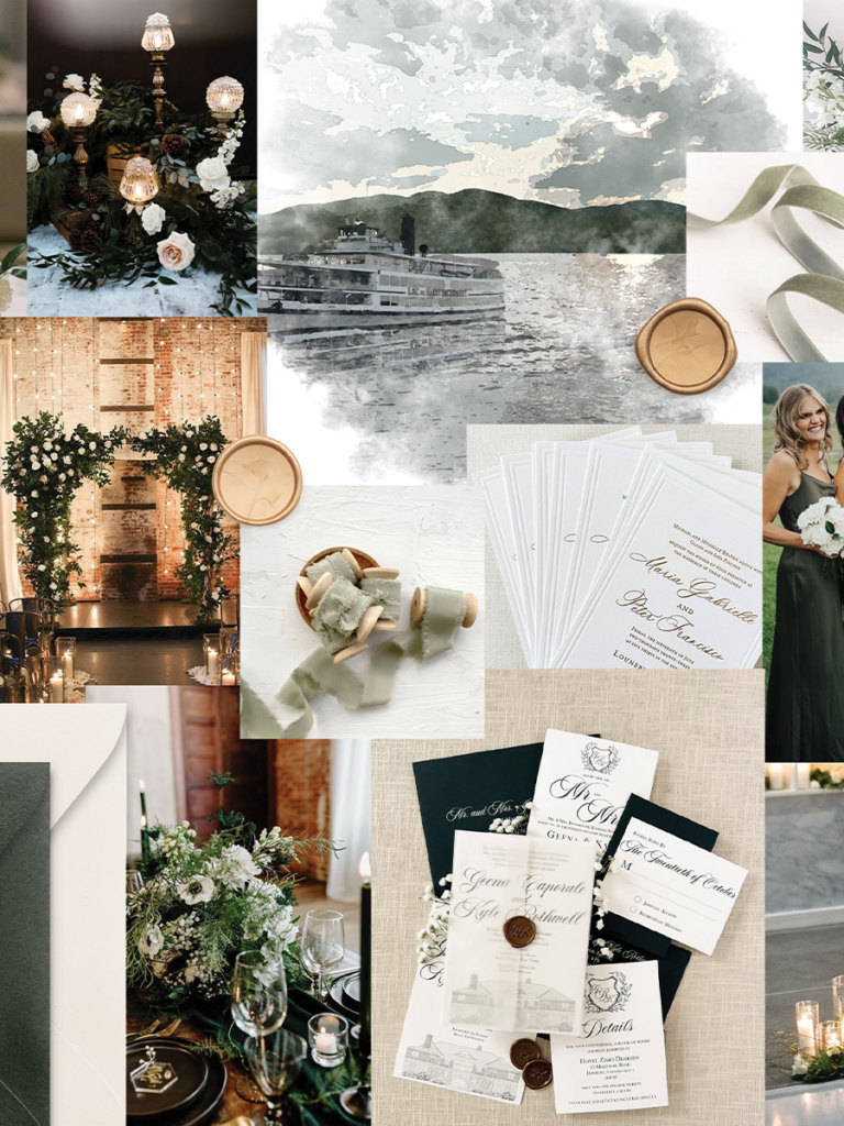
02. The Inspiration and Moodboard
I am a very visual person, (obviously)! Gathering inspiration and creating a moodboard is essential to my process. It helps get all my ideas out of my head and on to paper. It is also a super vital part of the design process to ensure what I am envisioning is also in line with what the couple is looking for.
From the words listed above, I developed a moodboard as a way to visually present my ideas to Jillian and Michael. Seeing how the overal vision of the day will come together along with my previous work as inspiration and a starting point. I will usually grab all different embellishment options and paper colors to see how they meld with the aesthetic.
One thing I really focused on when creating this moodboard was the focus on “Winter Wonderland” but not Christmas. That can be a tricky distinction to make so I wanted to make sure I had that nailed down before I moved onto creating the design.
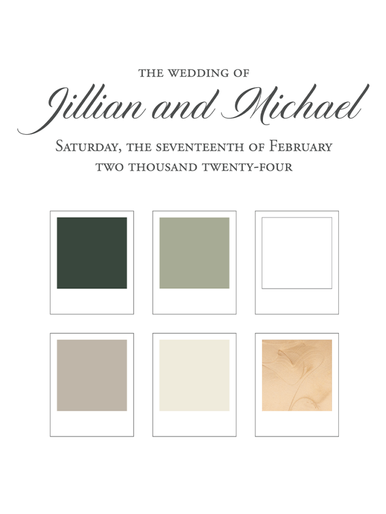
03. Typography and Color Palette
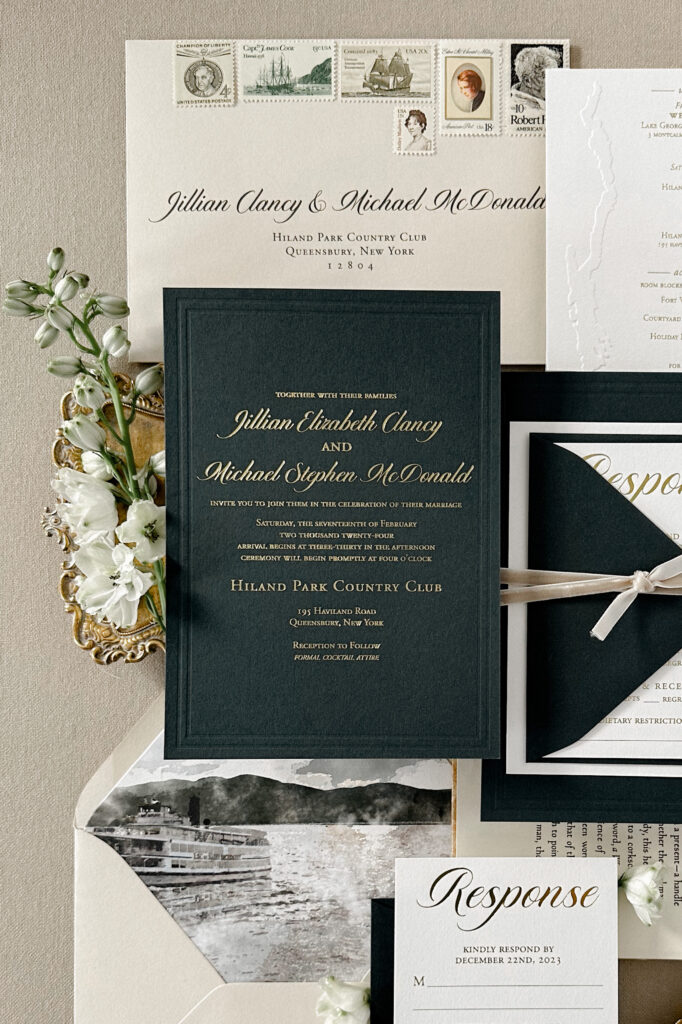
Once the moodboard is complete, I began color selecting from the images and papers chosen to create their color palette. Gold foil and emerald green were two aboslute must-haves for Jillian and Michael. It is really important to me to have a wide range of colors and shades to add dimension to the suite. That is why I added in this lighter moss green to pair with that deep emerald green. To offset the rich tones of gold and green, I opted for a muted beige, white and cream.
After the color palette is decided on, it is time to jump back to that word list to curate the perfect font pairing. One thing Jillian mentioned a few times throughout our conversations was that she wanted it to be formal, but not too formal. With that being said, I opted for a script font that was a little more modern than old-world. However, in Jillian’s middle name, Elizabeth, we didn’t like the way the “z” was written. So I got to work and drew a custom script “z” to match the style of the rest of the font but take on more of a “z” form than the traditional script form. Reason 57 to work with a custom wedding stationer! The semi-custom script font was paired with my favorite and go-to serif font for text. This font has a little bit of charm and character in the type setting but subtle enough to only compliment the script, not devalue it, which is really important when it comes to pairing fonts.
04. Material Selection, Print Method and Artwork
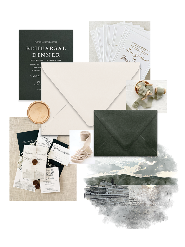
Now we were onto the fun, pretty paper part! I went back to the moodboard that was created along with the color palette and began color matching. When Jillian first reached out, she was really interested in doing a emerald green invitation card, something I have never done before but was definitely ready to take on! I centered the material selection around this, opting to pair the invite with a light beige for the main envelope, white response and enclosure card, emerald green response envelope and rehearsal dinner card, and neutral velvet ribbon.
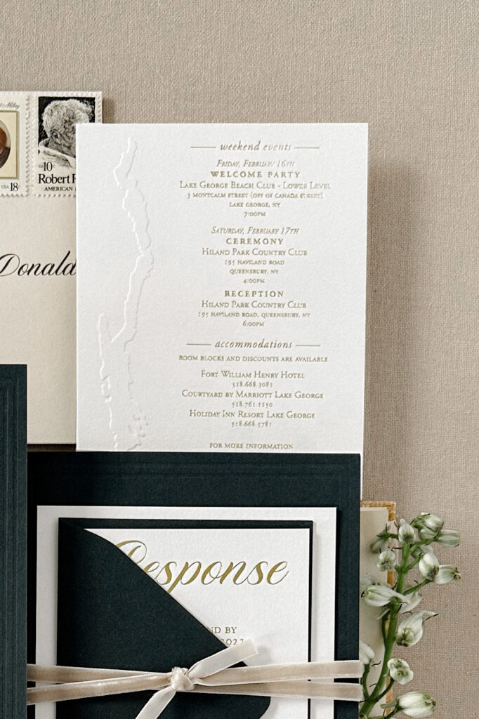
When deciding on the print methods for this invitation suite, gold foil was a must. Their three main cards, invitation, response, and enclosure card were to be printed with gold foil while the rehearsal dinner card was going to use white ink. This helped differentiate the invitation and rehearsal dinner cards and left the real wow factor up to the invitation. On the enclosure card, we did a embossed shape of Lake George which was super important touch to add since it was a destination wedding for most of their guests.
The artwork of this suite included a custom watercolor scene that was going to be the focal point featured on the envelope liner. I leaned into the shades of green, beige and cream that were chosen for the color palette to really embrace the creation of and round out the suite. The views of Lake George are gorgeous but I wanted to ensure guests knew this scene was actually of Lake George (thanks to Jillian’s personal reference photos!) and not just a random lake and mountain scene. The Lake George Steamboat Company is a real icon to the area. I referenced a few of Jillian’s photos to add the steamboat to the scene. Now, there was no way guests would think the destination was anywhere else!
Jillian and Michael had already received their sample box so they knew the exact textures, print methods and materials their suite would consist of. Nothing was a surprise!
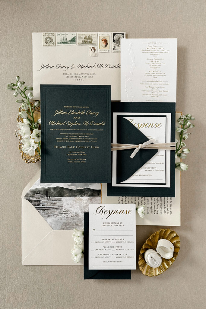
05. The Final Result
After a month of design work, it was time for the suite to be sent into production and assembled! When the suite arrived, I was in awe with its beauty. It came out even better than I could have imagined. It is always an exciting moment to see the suite come together in real life than just on the computer screen. I guess that is why I went into the stationery business!
At first glance, it looks like a beautifully curated and styled suite. But knowing the work and decisions that went into creating every aspect this suite, it means that much more. Every element was pondered over, meticulously chosen, and designed to create a one-of-the-kind invitation suite for Jillian and Michael’s winter elegance, Lake George wedding.
